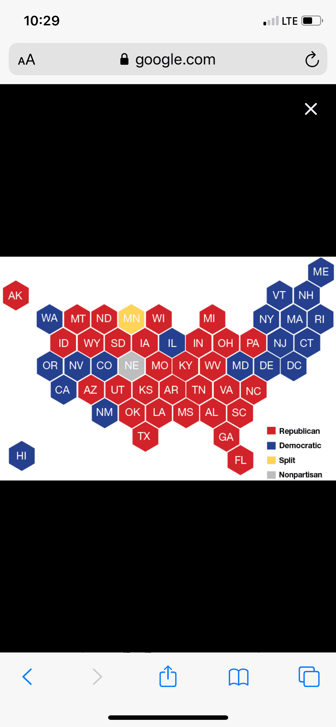
You can easily see on the map that the blue collared working man is all Republican, all the major "urban" cities that depend on the government for help and welfare, all blue!
The funny thing about that is:
the Blue States have funded the Red states for decades (the prime source for this information since the 1980s was the think-tank The Tax Foundation who saw that no Red State was going to pay their own way after 2006 so they stopped collating the info on their web pages).
Want a few good examples of
how the right wing will just bury data when reality conflicts with their world view?
The Koch-funded Tax Foundation think tank collected federal tax information since Tax Year 1981 until 2005. How much each state got spending for every dollar in taxes they received. You’ll see later that they even called it “famous”. They were very proud of that service they provided as a think-tank. It was intense. So much data, and then broken down yearly as to who were paying for the ride and who were just mooching.
One of their pages here still mentions it.
Let me quote a little of it.
Shuster went on to use the
Tax Foundation’s Federal Taxes Paid vs. Spending Received by State study in calling Sanford a hypocrite when it comes to federal government spending.
“The problem is that South Carolina has been spending money it doesn‘t have for a long time. According to the Tax Foundation and census figures, for years South Carolina has been spending far more federal funds than it contributes in taxpayer dollars.
“In 2005, the most recent year available, for every dollar South Carolina contributed to the federal Treasury in taxes, South Carolina got $1.31 back from the federal government to spend."
Great! They linked to their own site. You may have notice I included the link that goes right to all that juicy research. Let’s click on it...
"404 Looks like you found a loophole on our site!"
Yowser! That’s embarrassing. All that data and it’s just mysteriously ...gone!
Here is a blog post that mentions it in 2010.
Red States Mostly Welfare States Dependent On Blue States But Likely Too Uninformed to Know
Corroborating data can be found at the
Tax Foundation. I extracted the data and created an easy to understand table. The dollar amount is the amount received for every dollar the state sends to the Federal government. The chart is effective for year ending 2005 (latest available data). Red states colored red and blue states colored blue That link in full is
http://www.taxfoundation.org/research/show/22685.html#ftsbs-timeseries-20071016 ...but now it just points right to the front page of the website.
What was it showing? Decades of red states leeching and blue states paying. As the years went on, some Red states that were holding their own went into the leaching group. And in the final year, Tax Year 2005,
only one state that would later vote for John McCain instead of Barack Obama in 2008 was paying its own way. Texas. And it had slipped very close to the parity line.
Then, in Tax Year 2006? No data, no famous report, no press releases mentioning the report. Eventually, as you see from the dead links above, the Tax Foundation pulled it all from their website. Down the Orwellian rabbit hole, but unlike 1984 there are still traces on the web that mentions the data.
So what happened in 2006 to Texas? The state that came closest to crossing the line in 1989 and 2003? Exactly what you thought.
Texas became a mooching State for good. Before I post from this link, note it’s from 2012.
One frequently cited validation for that go-it-alone attitude is that Texans get a bad deal by paying more in federal taxes than they receive in federal spending. For decades, that was true: Texas received 90 cents or less for every dollar its residents and businesses sent to Washington. But that’s no longer the case. Thanks to demographic shifts, a surge in military spending and other factors, Texas has crossed the break-even line.
In six of the past eight years, including the entire tenure of President Barack Obama, Texans got more out of the federal Treasury than they put in. We know from Tax Foundation numbers (even though they’ve deemed them too embarrassing to exist) that in the period of 2004-2012 (those past eight years) that Texas was just paying its own way for 2004 and 2005. But starting in 2006, Texas became a moocher.
Every. Single. Republican. State. Was. Mooching.
The Tax Foundation spent a lot of time collecting the data. They’d have known their ****ty talking point had hit the fan of truth, so they did what any right-winger would do when reality proves them wrong. They ignore reality. Delete the reality in a hurried fashion (if they had done a better job, they wouldn’t have left links pointing to the pages their ripped from their own book). When the right-wing think tanks started the Tea Party rallies, when Red state people were saying they were “taxed enough already”,
NOT ONE RED STATE AT THE TIME WAS PAYING THEIR OWN WAY. EVERY SINGLE ONE WAS A SCROUNGING STATE.
It’s not hard to see why Red states need these handouts. Low population, and spread out over a large state. As even the people that found out the numbers,
The Tax Foundation, said (until they delete this of course)...
"This morning we released our famous annual analysis of
federal taxing and spending by state—popularly known as the “giving and receiving states” report...
...states that get the "worst deal"—that is, have the lowest ratio of federal spending to taxes paid—are generally high-income states either on the coasts or with robust urban areas (such as Illinois and Minnesota). Perhaps not coincidentally, these "donor" states also tend to vote for Democrat candidates in national elections. Similarly, many states that get the "best deal" are lower-income states in the mid-west and south with expansive rural areas that tend to vote Republican. Like I said earlier: famous. You’ll notice that page points to the data too.
https://taxfoundation.org/legacy/show/62.html is the full link. Again, it routes right back to the front page now.
Here’s the best bit though. The Tax Foundation scrubbed everything in HTML format mentioning these years of analysis. Do you know what they didn’t scrub?
The actual data in PDF format! So now you see everything I mentioned here today.
And it's not just at the national level. Within states themselves,
it's those robust, urban, Democratic Party areas that subsidize the rural, more conservative, Republican Party areas...
"The Indiana study is consistent with the results from other states that examined the distribution of state government finances, the fiscal policy institute said in its report. "
... which proves the whole idea that right-wing people have that they're the ones being 'Taxed Enough Already' is a delusion, a bare-faced lie where the truth has been proven by right-wing supporters themselves for decades. It's not even open for discussion, they crunched the numbers themselves to prove the Dems are the bill payers. If the rural areas of the country had to pay their fair share or face the financial consequences, they'd be living by dirt roads in tin shacks with nobody willing to run electricity to them